Here at ActionVFX, we are committed to empowering today's visual effects community with best-in-class storytelling resources. In the ActionVFX “Power” Blog Series, we will discuss several key elements that will not only challenge and equip you as a visual storyteller, but engage critical thinking to ensure your story is as powerful as possible.
SETTING THE STAGE
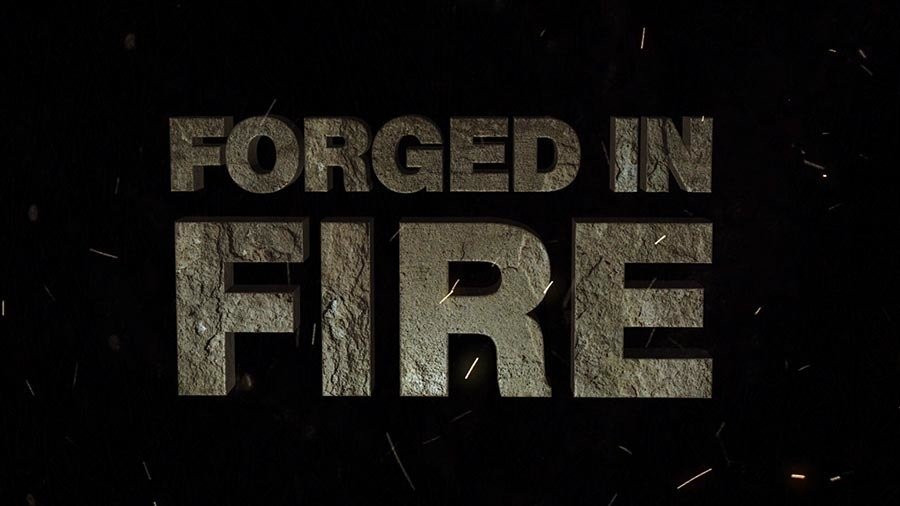
Everyone loves a cool title sequence. Maybe you haven’t even thought about including a title sequence in your project for a specific reason - but adding an interesting title sequence to your movie or short film could really add a level of professionalism to your production, prepare the audience for the tone of the film, and get them hyped for what’s to come.
A great title sequence is almost like a mini-movie that stands on its own before the main feature. It can also greatly boost your film’s perceived production value.
Check out this awesome intro from “Mission: Impossible - Ghost Protocol.”As you’re thinking of your title sequence, get some inspiration from Art of the Title - it’s an incredible website that breaks down some of the most popular title sequences in movies.
A title sequence usually has at least three key components: music, text, and compelling graphics that connect to a theme or idea within the movie. We’ve already discussed the power of music in your project, so let’s tackle the element of “text” - more specifically, “typography.”
WHAT IS TYPOGRAPHY?
Wikipedia defines typography as “the art and technique of arranging type to make written language legible, readable, and appealing when displayed.”
Typography is more than just text that simply conveys information; typography seeks to style text in such a way that it becomes visually appealing. It’s text that the viewer wants to read, because it is presented in an interesting way. Text could be interesting because of the chosen style/font, or even the placement of the text, and how it is integrated into a scene.
The “Mission: Impossible” title sequence gave each line of text a moment to breathe in the spotlight, as action in the background either paused or slowed down when the text appeared. They also directed the viewer’s attention to certain areas on the screen, by positioning the camera and background elements where the text would be appearing, so you are subconsciously looking for where the text will pop up next.
You could use b-roll from your movie in a similar way, to actually make your text a living part of the intro scene, rather than simply text resting on top of a background. Motion-tracking text is also a great way to do this.
A lot of movies not only feature title sequences, but also closing credit sequences that send the audience away with the tone of the movie, and can add to the film’s lasting impact upon its audience.
We could spend a lot of time on color theory, kinetic typography animation techniques, and a deep-dive into all the nuances of typography for your title sequence, but for the sake of time, we’re going to look at a brief overview on fonts, along with a couple great resources to guide you on your quest for the perfect title sequence.
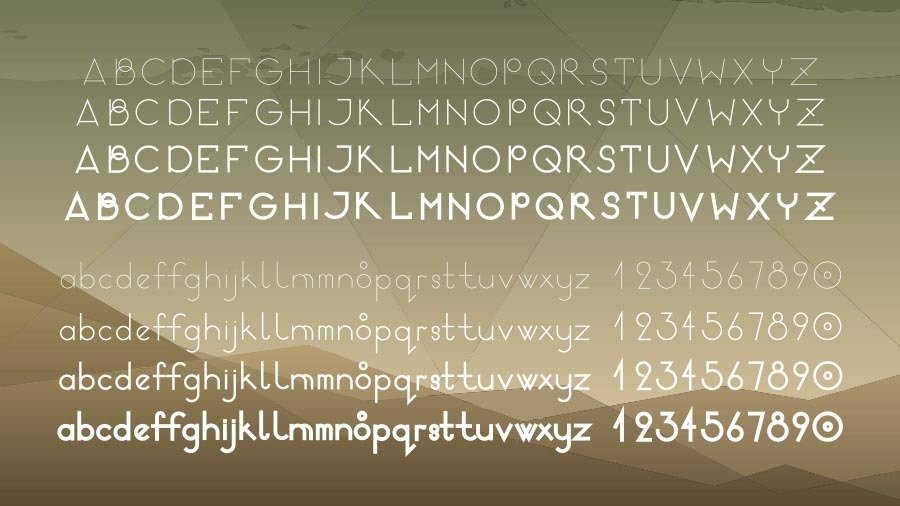
CHOOSING THE RIGHT FONT(S)
Last week, we talked about the ditch you can find yourself in when selecting the perfect soundtrack for your scene. It’s easy to become overwhelmed with so many musical choices, and lose your focus. The same warning can be made about looking for the right font(s), but luckily, it’s a bit easier than music, because you aren’t sifting through several seconds to minutes of audio to find what you like.
Just because a font looks cool on a website doesn’t mean it will translate appropriately in your title sequence. Also, for every decent font on the internet, it seems like there are at least fifty tacky ones (right?!), so make sure your font selection couldn’t be perceived as cheap or distasteful. Find fonts that convey the tone of your movie, but don’t look amateur.
Also, try to use fonts within the same family, but different weights. This adds an element of cohesion to your titles, and keeps them from visually competing with one another. For instance, the title of “art director” might be in a light weight font, but the name of the art director beneath the title could be a bold or extra bold weight of that font, or vice versa.For a ton of great fonts that are free for commercial use, check out Font Squirrel.
If you’re planning on using multiple fonts instead of just multiple weights of the same font, make sure they complement one another. Also, it’s typical to use only two to three fonts at most to maintain a clean, professional look. A really great resource worth diving into to learn more about typography and font pairing can be found if you click here.
Most importantly of all: your font selection needs to be legible. Edgy, scrawled text or distressed fonts can be fine - but they need to be easy to read by the audience, or they become a gimmicky distraction.
You can even create custom fonts, but that process can cost time and money. However, Calligraphr lets you design your own hand-written font by taking a photo of letters you write on a template you print from their site, which is really cool! There are both free and paid versions of accounts on their site.
Use your newfound knowledge of typography to design an awesome title sequence for your production, and even put together a slick one-sheet using graphics from the title sequence to promote it. Also, remember that great site,Art of the Title to get some inspiration for your new title sequence.
Your audience will be pumped for your movie before it even starts!
First time here? ActionVFX creates action stock footage for VFX and filmmaking. (We also have some great free stuff!)
Remember to connect with us on our social networks to stay updated on our latest news, giveaways, announcements and more!